

Colour palette
🎨 What is a Color Palette?
- A color palette is just a group of colors chosen to work well together.
- Think of it like a playlist of colors instead of songs.
🧩 How It Works
- Base Color – the “main” color (like the lead singer in a band).
- Accent Colors – supporting colors that make the base color stand out.
- Neutral Colors – calm colors (like gray, white, or beige) that balance everything.
🌈 Why It’s Important
- Designers, artists, and app makers use palettes so their work looks nice, organized, and easy on the eyes.
- Without a palette, things can look messy or confusing.
🕹 Example
Imagine you’re designing a game:
- Base color: Blue (for the background sky)
- Accent color: Yellow (for coins or stars)
- Neutral color: White (for text so it’s easy to read)
🔑 Quick Tips for Students
- Stick to 3–5 colors in your palette.
- Use contrast: dark + light colors so things are readable.
- Think about mood: red feels exciting, blue feels calm, green feels fresh.
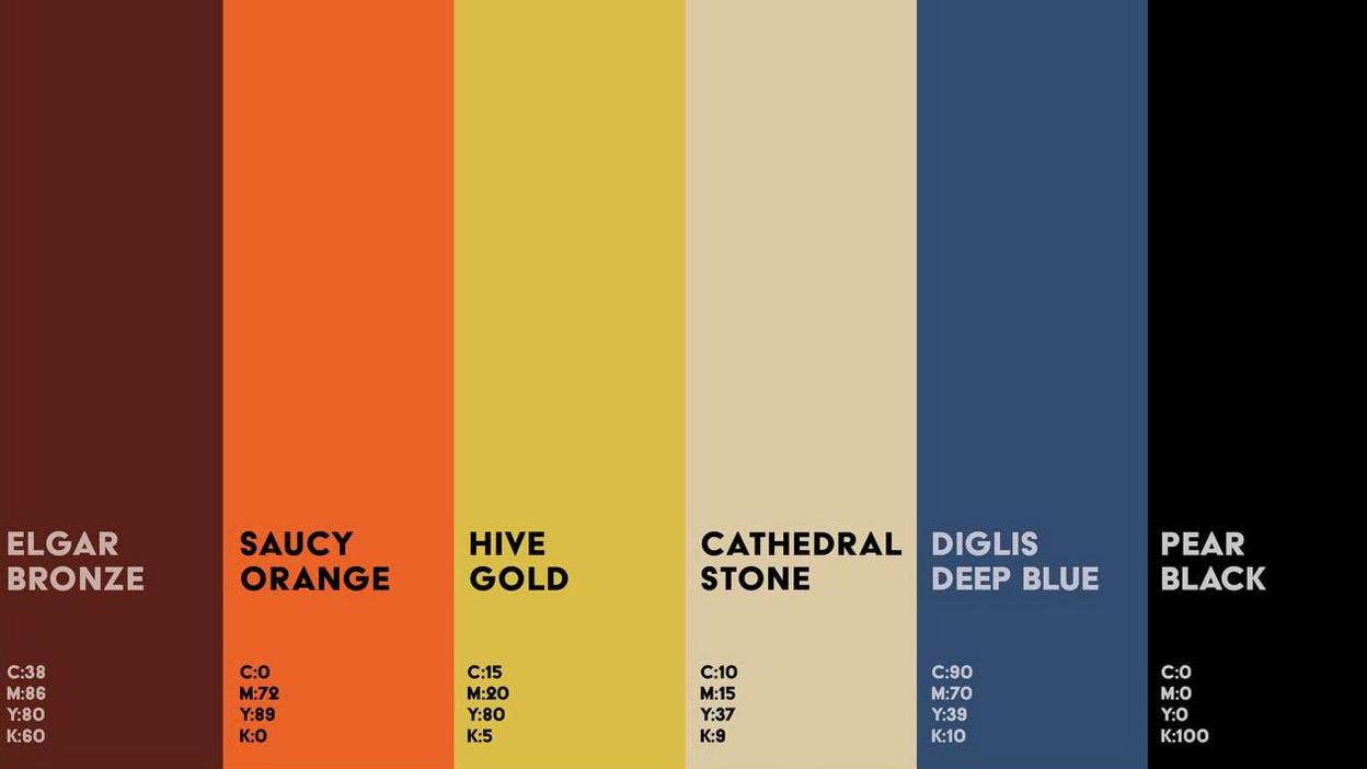
Here’s a simple color palette chart that shows how base, accent, and neutral colors can work together 🎨.
Here’s an example of how a color palette can be applied in a simple game screen design 🎮:
- Blue = background (base color)
- Yellow = coins (accent color)
- Green = character (extra accent)
- Gray + White = text and title (neutral colors for readability)

Here is the previous explanation translated into English:
To use a color palette in an advertising poster aimed at 14-year-olds, the most important thing is to choose a few colors that communicate the message and are visually attractive.dpplus+2
Key tips for the color palette
- Use a maximum of 2 or 3 main colors to avoid confusion and make the poster easier to understand.dcerodigital+1
- Choose colors that connect with young people: bright, energetic, and fresh colors like blues, greens, yellows, or oranges usually attract more attention at that age.artyplan+1
- Apply the 60-30-10 rule: use 60% of one main color, 30% for a secondary color, and 10% for details or attention grabbers.dcerodigital
- Create contrast: combine light and dark colors to make the text stand out from the background (for example, white text on a blue background or black text on a yellow background).vistaprint+1
- Consider the meaning of the colors: choose tones according to the emotion they trigger (red = action, blue = trust, green = calm, etc.).artyplan+1
- Don’t overload the poster: less is more; a simple palette is more effective and modern for teenagers.damos+1
Simple and practical example
- Choose a main color, for example, blue.
- Select a secondary color that matches, like green.
- Use an accent color for details, such as yellow to highlight the title or a special offer.
- Apply contrast: leave the background in light blue, the text in white, and the details in intense yellow.
- Make sure all text is readable and the colors don’t make it hard to read.
The primary colors in traditional art are red, yellow, and blue. These colors cannot be made by mixing other colors and serve as the foundation for all other colors on the color wheel.
Secondary colors are created by mixing two primary colors in equal parts. The three secondary colors are orange (red + yellow), green (blue + yellow), and purple or violet (red + blue).
This basic structure is used in painting, drawing, and most color theory for visual arts.